佛罗伦萨远景配色方案
透过深色树叶的框望见佛罗伦萨的穹顶。边缘是浓重的阴影,中间是浅色石材——天然的高对比组合。
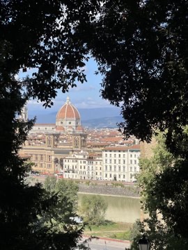
氛围: 高对比 · 城市远景 · 柔灰
六种颜色
最佳文字搭配
树影间的佛罗伦萨 — #C9C7C3 / #0A0B0B · 对比度 11.6:1
CSS 变量
:root {
  --florence-through-trees-1: #0A0B0B;
  --florence-through-trees-2: #AAA398;
  --florence-through-trees-3: #252827;
  --florence-through-trees-4: #C9C7C3;
  --florence-through-trees-5: #7F8173;
  --florence-through-trees-6: #4E514C;
}
照片由陈正豪拍摄。颜色以 k-means 聚类提取;百分比为每种颜色在照片中所占的比例。
做你的第一张色卡iPhone 与 iPad 免费下载 · iOS 16 及以上