Florence view color palette
Florence's domes seen through a dark frame of leaves. Deep shadow on the edges and pale stone in the middle — a natural high-contrast pair.
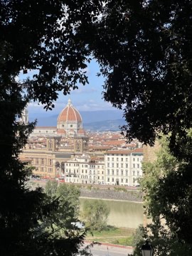
Mood: high contrast · city view · soft greys
The six colors
Best text pairing
Florence through the trees — #C9C7C3 / #0A0B0B · contrast 11.6:1
CSS variables
:root {
  --florence-through-trees-1: #0A0B0B;
  --florence-through-trees-2: #AAA398;
  --florence-through-trees-3: #252827;
  --florence-through-trees-4: #C9C7C3;
  --florence-through-trees-5: #7F8173;
  --florence-through-trees-6: #4E514C;
}
Photo by Zhenghao Chen. Colors extracted with k-means; percentages are the share of the photo each color covers.
Make your first color cardFree on iPhone & iPad · iOS 16 or later

Make a palette from your own photo →