フィレンツェの眺めのカラーパレット
暗い葉の額縁越しに見るフィレンツェのドーム。縁には深い影、中央には淡い石の色。自然にできた高コントラストの組み合わせです。
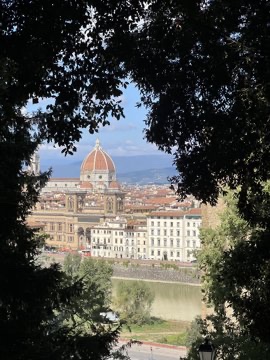
雰囲気: 高コントラスト · 街の眺め · やわらかなグレー
6つの色
おすすめの文字色の組み合わせ
木々の間のフィレンツェ — #C9C7C3 / #0A0B0B · コントラスト比 11.6:1
CSS 変数
:root {
  --florence-through-trees-1: #0A0B0B;
  --florence-through-trees-2: #AAA398;
  --florence-through-trees-3: #252827;
  --florence-through-trees-4: #C9C7C3;
  --florence-through-trees-5: #7F8173;
  --florence-through-trees-6: #4E514C;
}
写真:Zhenghao Chen。色は k-means で抽出。パーセンテージは各色が写真に占める割合です。
最初のカラーカードを作るiPhone・iPadで無料 · iOS 16以降