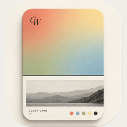
Editorial poster — a magazine cover from your photo
Free
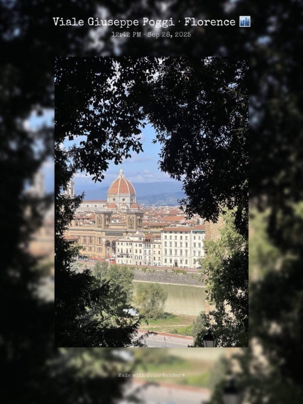
A print-poster layout: wide margins in one color, a shadowed photo in the middle and type you’d expect on a gallery poster.
What it looks like
The whole card is one color. The photo sits inside it with a soft shadow; above it the place is set large like a headline, with the time underneath.
What you can change
- Frame thickness: 18–65%
- Photo corner: from a hairline square to a rounded squircle
- Background opacity: fade the color so the photo shows through it
- “Made with ColorWander” mark (Pro can turn it off)
Good for
- City walks and architecture
- Exhibition visits
- Posts that should look like print
Tips
- Thicker frames feel more like a printed poster
- A short place name makes the strongest headline
Make your first color cardFree on iPhone & iPad · iOS 16 or later

Related layouts
Free, limited-time-free and Pro status as of version 1.5.0. Every Pro layout can be previewed on your own photo before you decide.