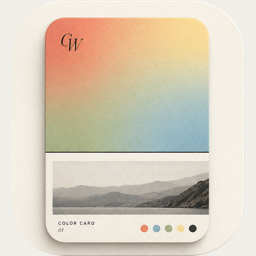

Color bottom — the photo first, its color below
Pro
The mirror of Color top. The photo comes first, and the color band underneath works like the mount of a print.
What it looks like
The photo fills the top of the card and a solid block of color fills the bottom, with the caption centred in it.
What you can change
- Split slider: how much of the card is color (20–50%, snaps at 20, 25, 33 and 50%)
- Background opacity: fade the color so the photo shows through it
- “Made with ColorWander” mark (Pro can turn it off)
Good for
- Photos whose subject sits high in the frame
- Landscapes with a strong horizon
- A caption that reads like a signature
Tips
- A dark color under a bright photo feels like a gallery mount
- Pair it with a serif font for a quieter feel
Make your first color cardFree on iPhone & iPad · iOS 16 or later

Related layouts

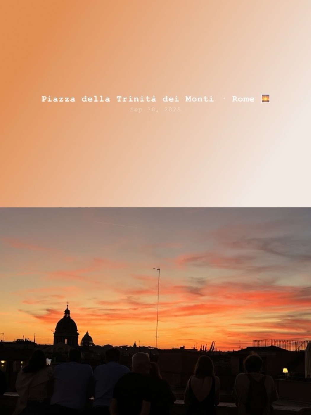




Free, limited-time-free and Pro status as of version 1.5.0. Every Pro layout can be previewed on your own photo before you decide.