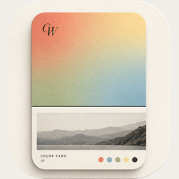
How to make a color palette from a photo on iPhone
 By Zhenghao Chen ·
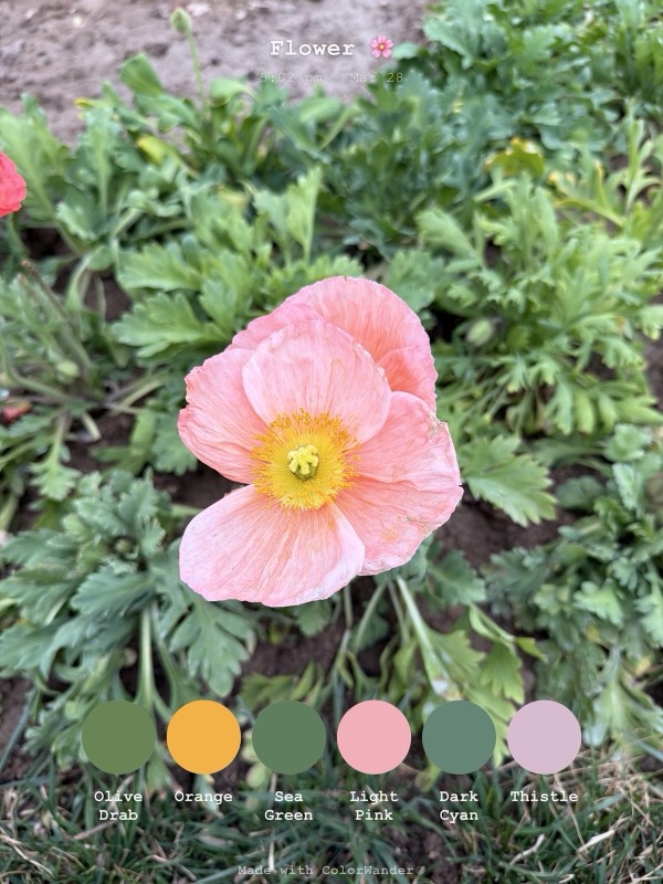
Every photo already has a palette in it — the blue of the sky, the warm stone of a wall, the green of a tree in shadow. Pulling those colors out and showing them next to the photo is one of the simplest ways to make an ordinary picture feel designed. Here is how to do it on iPhone with ColorWander.
Step by step
- Download ColorWander from the App Store (free, iPhone and iPad, iOS 16 or later). No account needed.
- Pick a photo. Choose one straight from your Photos library — photos taken on your phone keep their location and time.
- Let it read the colors. ColorWander finds the photo's dominant colors and builds a palette on your device; nothing is uploaded.
- Choose a layout. Start with Color top (free): a band of color, the photo and a caption. Swipe through the other layouts — palette bands, glass palette, ticket, postcard, calendar — on your own photo.
- Adjust. Change the caption, font, colors or ratio. Every layout re-colors itself from the palette.
- Export. Save a 2K JPEG for free, or 4K / lossless PNG with Pro. If you picked a Live Photo, you can save the card as a Live Photo too.
Photos that make great palettes
- Two or three big color areas. Sky plus building plus street gives a clean, readable palette.
- Soft light. Early morning, late afternoon and overcast days give richer mid-tones than harsh noon sun.
- One accent. A small red sign in a grey street makes the palette memorable.
- Close-ups of everyday things. Breakfast, flowers, fabric and fruit often give the most surprising palettes.
Where to use a photo palette
Color cards work as Instagram or Xiaohongshu posts, travel journals, mood boards, wallpapers and a quiet record of ordinary days. The Gallery keeps every card re-editable and lets you find them later by color, location or time — so a year of cards becomes a palette of your year.